
A frayed brush stroke with “Grand opening!” in patchy script on top, a few doodled hearts, three line-drawn icons and a wall of text underneath. You know this poster. You have probably seen it a dozen times in the last few weeks, for a dozen different things.
Our founder Michael Sinnhuber puts it bluntly: “I now scroll past AI posters faster than I can read them. And when a proposal is obviously a quick AI job, that rules the company out for me. Even if the service behind it might be good.”
He is not alone. And that is exactly the problem.
What the AI look looks like
An up-to-date image AI produced the five posters below. Each one from a single short prompt, the kind countless people type every day. The businesses are made up. The prompts were written in German, and the poster text was then translated into English, also by AI.
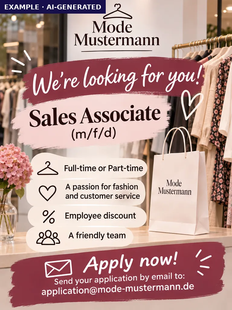
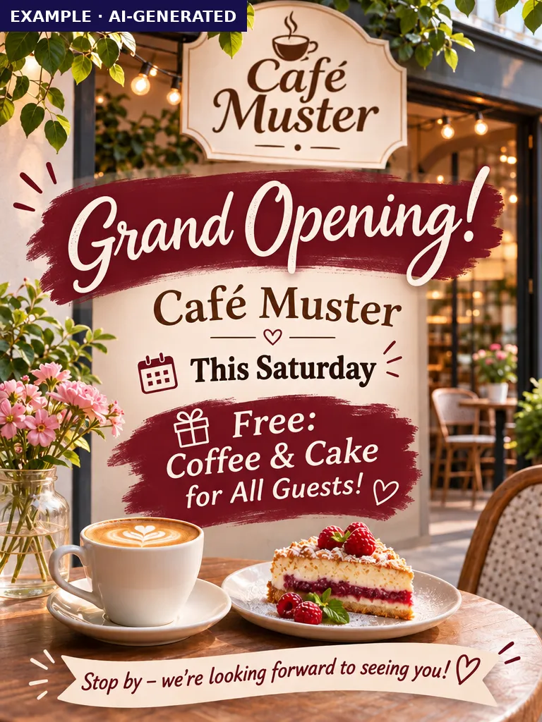
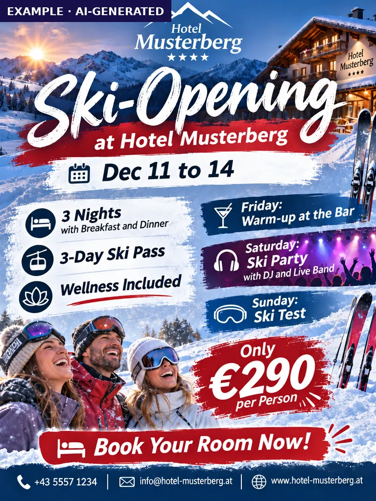

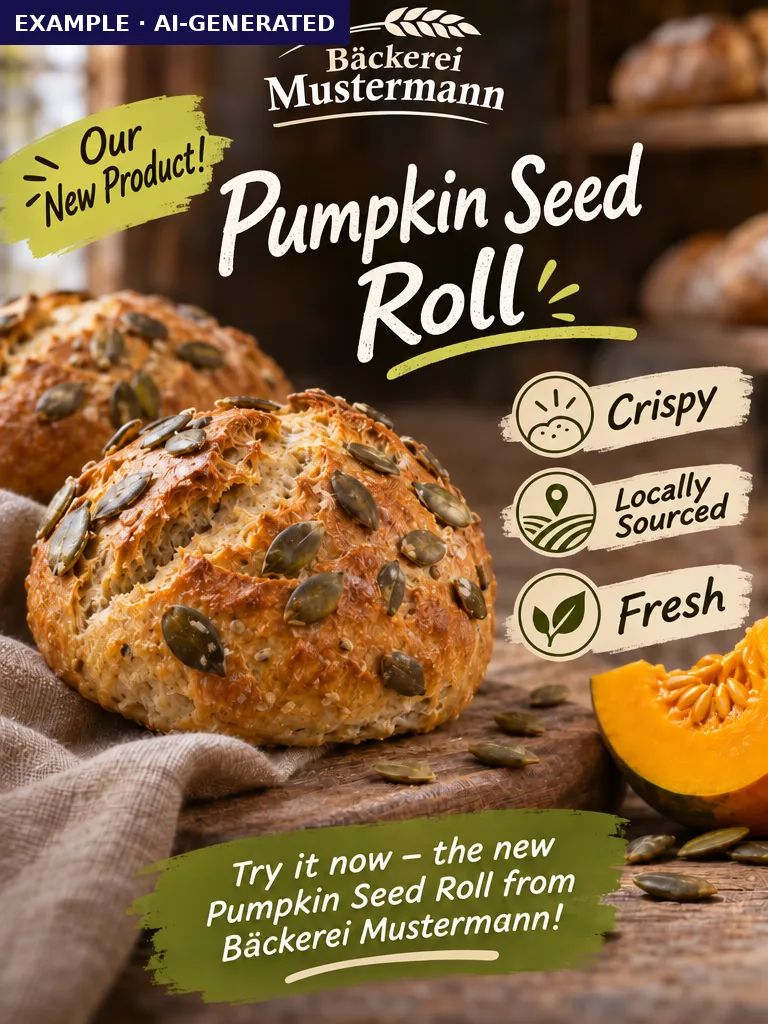
Five completely different occasions, one look. The features repeat so reliably you could tick them off:
- The frayed bar. Text almost never sits on a clean shape. It sits on a brush stroke with ragged edges. Never a rectangle.
- The broken font. Usually a script typeface that isn’t filled solid but looks patchy, as if it had been worn off.
- Doodled hearts. There is always one somewhere. Usually several.
- The hand-drawn style. Line-drawn icons and scribbles, often above three product claims like “Crispy. Local. Fresh.” that are so generic they fit anything.
- Crammed full. Every free inch gets filled, visually and with words. White space doesn’t exist.
- Wooden boards instead of neon. Internationally it often glows in neon. Around here, wooden boards, chalkboards and brush strokes dominate.
- The airbrushed image style. Six-fingered hands are rare these days. Instead there is a uniform look that softens everything, lights it perfectly and makes it flawless.
- Landscapes that don’t exist. For a stock image, that wouldn’t matter. When you are promoting an actual place, it’s a disaster. Mountains, lakes and bridges appear that don’t exist within a hundred kilometres.
- The made-up logo. Worst of all is when the real logo is replaced by one the AI invented. It carries the company name but has nothing to do with the real logo. Or there is no logo at all.
None of these proves anything on its own. Together they add up to a style many people recognise at a glance.
When the big idea backfires
It almost always starts with good intentions. Let’s make a really striking ad. Someone types a few words into an AI and gets a poster in seconds that is far beyond anything they could ever build themselves in a design tool. So they assume it’s great.
That is exactly where they’re wrong. Nobody did any thinking here. The AI simply executed a weak prompt as best it could, and the result is what weak prompts always produce. Garbage in, garbage out.
So your audience doesn’t see a striking ad. They see “another AI thing”. And they draw a conclusion that is fatal for your offer. If you didn’t put any thought into your marketing, maybe you don’t put much into your work either.
Advertising is supposed to get noticed and build trust. The AI look undermines both.
Interchangeable across every industry
Ads within one industry can look alike, and that’s nothing new. Plenty of accountants show a handshake and a calculator, plenty of hotels a pool and a mountain view. The AI look goes one step further. It looks the same in every industry.
The fashion store’s job ad looks like the hotel’s ski opening and the bakery’s new bread roll. That has a consequence many people underestimate. Your offer no longer competes only with your direct competitors. It competes with every AI-made ad for every product, service and event scrolling through the same feed today.
In a sea of sameness, you are not hard to see. You are invisible.
Menus and offers too
The uniform look doesn’t stop at posters. It has crept into menus, specials boards, price lists and the proposals service providers send out.
At this point it is no longer about visibility. It’s about the buying decision. As Michael puts it: “When a menu or a proposal looks like AI from a mile away, I lose any interest in buying. I start wondering where else they cut corners.”
What this year’s surveys show
The real flood of AI advertising has only reached us in 2026. This year’s numbers match what we see every day:
- Harris Poll, June 2026: 73% would trust an ad less if they suspected AI made it. 63% would be less likely to buy from a brand that uses AI-generated ads. (Marketing Brew, June 2026)
- Klaviyo, March 2026: In a survey of 8,000 adults across eight countries, only 7% said visible AI-generated marketing makes them trust a brand more. 31% said it makes them trust the brand less. (EMARKETER)
- TechRadar, September 2026: AI posters for events and cafés have spilled out of social feeds into shop windows. One illustrator quoted in the piece observes that practically all events now share the same branding. (TechRadar)
NielsenIQ showed why as early as 2024, using brain measurements. People usually recognise AI ads intuitively, describe them as “annoying”, “boring” and “confusing”, and even well-made AI ads are remembered less. (NielsenIQ, December 2024)
Bad advertising is nothing new
To be fair, the problem isn’t new. Ads without a clear idea, without a defined audience and without a reason to look existed long before AI. The difference is that advertising used to be made mostly by specialist agencies. People who designed their own material could often see that the result wasn’t good enough.
Today everyone thinks they can do advertising, because AI turns even the weakest prompt into something that looks professional at first glance. The fact that it looks exactly like every other weak-prompt result is lost on precisely the people who don’t know any better. Their audience notices.
The reason is simple. AI learns from millions of existing images and, given a vague brief, delivers the most likely answer. The most likely answer is the average.
If you don't give AI an idea of your own, you get back everyone else's average.
The same thing is happening to presentations and proposals
What is obvious on posters is just as true of slides. Decks from AI tools have their own uniform look. The same layouts, the same airbrushed images, the same three-buzzword headlines, the same icon next to every bullet point.
In a presentation, this costs you even more than on a poster. A poster only needs to grab attention for a moment. A presentation or a proposal has to convince people that you are the right choice. If your pitch looks exactly like your competitor’s, because both of you fed the same tool the same vague brief, you waste the very moment you should be standing out.
AI as a tool, not as the author
Let’s be clear. We work with AI every day. As a tool, and above all as a sparring partner, it is invaluable. It helps you sort your thinking, explore variations, sharpen copy and challenge your own work.
But that only works if you know what you are doing and what you want. Who is your audience? What should they think, feel and do? What will convince these particular people? No AI can answer those questions for you. Skip them and you end up with bad advertising, with or without AI.
AI as the author is a disaster. Not because the output is technically poor, but because it is uncreative and therefore interchangeable. It makes good services and offers look worse than they are.
How to stand out
- Idea before tool. Decide on your one message and why anyone should look, before you open any software or AI.
- Design for a specific audience. “Everyone” is not an audience. The more precisely you know who you are designing for, the less generic the result.
- Less is more. One message, one image, one action. Everything else belongs on your website or in a conversation.
- Real images instead of fantasy worlds. Real people, real places, real products. An honest photo of your town beats any invented mountain backdrop.
- Your real logo and a look of your own. Your own colours, your own typeface, your own visual language. Anyone who has seen you once should recognise you next time.
- Use AI for the process, not the result. Let it suggest ideas and variations and critique your drafts. You make the call on what is good.
- Run the swap test. Put your ad next to one from a completely different industry. If you could swap them, start again.
Frequently asked questions
How can you tell an ad was made by AI?
By recurring patterns. Typical are text on frayed brush strokes, patchy script fonts, doodled hearts, line-drawn icons, three generic product claims such as “Crispy. Local. Fresh.”, wooden-board backgrounds, an airbrushed image style, landscapes that don't exist and made-up logos. And almost every inch is crammed full. None of these proves anything on its own. Together, the look is hard to miss.
Can AI-generated advertising hurt a brand?
It can. In a Harris Poll survey published in June 2026, 73% said they would trust an ad less if they suspected AI made it, and 63% said they would be less likely to buy from a brand that uses AI-generated ads.
Should I stop using AI for marketing and presentations?
No. Use it as a tool and a sparring partner, not as the author. AI is great for sorting ideas, drafting variations and critiquing your work. The idea, the audience and the call on what is good have to come from you.
Why does AI advertising all look the same?
Because AI learns from vast numbers of existing images and, given a vague prompt, delivers the most likely result. The most likely result is the average. Type “poster for our grand opening” and you get the same average as everyone else.